Critics of new ‘dynamic’ disability symbol not just anti-PC cranks
A group of activists in Ontario has launched a petition demanding that the province adopt a new and improved version of the International Symbol of Access.
thestar.com
By EMMA TEITEL
April 26, 2017
There is probably no symbol in the world easier to identify (besides the Golden Arches of McDonald’s) than the International Symbol of Access.
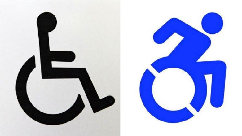
That’s the official name for the image painted outside thousands of accessible parking spots, restrooms and elevators. You know the one: it’s a picture of a stick figure sitting in a wheelchair - or more accurately - a stick figure melded to a wheelchair.
After all, the one-dimensional, angular design of the image makes it difficult to discern where exactly the wheelchair ends and the person sitting in it begins.
In fact, the original version of the image, introduced in 1968 by Danish designer Susanne Koefoed, depicts an empty wheelchair. The stick person was added to the image later, when designers realized the empty wheelchair might appear confusing to some. In other words, the person was an afterthought to the chair.
And according to accessibility activists, the person is still an afterthought to the chair.
This is why a group of activists in Ontario has launched a petition demanding that the province adopt a new and improved version of the International Symbol of Access: a “dynamic” image that depicts a person in a wheelchair in motion - a person whose arms are bent behind them to indicate that they are moving the wheels on their chair. The activists championing the new image call themselves the Forward Movement. They argue that the dynamic image, developed by a team of accessibility designers in the United States and officially adopted by New York City a few years ago, places the person front and centre, before the disability. Symbols matter; not only do people remember them, but research shows that they change how we perceive the world and the people around us. A dynamic symbol, the theory goes, is more effective than a static symbol.
But surprise, surprise, not everybody agrees. There are those, of course, who believe the campaign to change the symbol is a product of political correctness gone awry; the government has no business spending our hard-earned tax dollars to draw a bunch of new cartoons.
But there is a less obvious, far more interesting and valid criticism of the new image, a criticism I saw expressed again and again on social media these past few days, not by anti-PC cranks, but by people who have disabilities themselves.
The new image, these critics argue, is seemingly progressive, and its heart is certainly in the right place but it doesn’t account for the fact that not everyone who has a disability and makes use of accessible parking spaces and restrooms uses a wheelchair. The new wheelchair image, they argue, wouldn’t merely exclude disabled people who don’t use wheelchairs; it would perpetuate the stigma produced by the current symbol. That stigma being that when you have a disability but you’re not in a wheelchair, using an accessible parking space or restroom often makes you the target of all kinds of catty and hostile behaviour. Strangers give you nasty looks. They make snide comments. They wonder why you get the benefit of that prime parking space, or why you “butted” in line to the restroom when you appear not to need any assistance at all. They do this, presumably, because the universal symbol that indicates disability depicts a person in a wheelchair, not a person with a chronic pain condition, a bad hip, or any other disability that doesn’t necessarily require use of a chair.
“I certainly have experience with having my condition doubted because it's not visible, and I'm most often not using a wheelchair,” says Khairani Barokka, a London-based artist who deals with chronic pain and chronic fatigue. But Barokka, who is currently working on a PhD in the Visual Cultures program at Goldsmiths University in London says her discomfort with the wheelchair-centred symbol goes beyond personal experience.
“When discussing a ‘dynamic’ wheelchair sign,” she says, we run the risk of sending a message “that bodies are only valid and valuable if they’re ‘dynamic’ and can achieve certain levels of physical activity.” After all, a lot of people who use wheelchairs don’t use their hands or arms at all. Why should the new image serve those who wheel themselves around by hand, but not those who are unable to?
In other words, accessibility designers are damned if they do and damned if they don’t. No traditional image will ever accurately and fairly represent all types of disability.
Perhaps what’s needed then instead of a new, dynamic International Symbol of Access, is a universal symbol that isn’t quite so literal. In fact, why depict a person or a chair at all? Why not a shape, a flower, or something totally abstract that can stand in as a symbol for accessibility in all its forms?
Or in the absence of such a symbol, then in the very least a nationwide bulletin advising the following: if you see somebody park in a handicapped space who isn’t using a wheelchair, don’t be a jerk. Mind your own business, and carry on with your day.