Ontario’s 150 anniversary logo cost taxpayers $30K
Controversial Etsy-like 150th symbol has been panned by critics and social media.
Thestar.com
Jan. 25, 2017
BY Kristin Rushowy
Taxpayers spent $30,000 on the Ontario 150 anniversary logo that’s being drawn and quartered by critics.
Queen’s Park calls it “modular, dynamic” and says it is “ever-changing to represent the energy thriving in Ontario ... (in a) hand-drawn typeface to represent the rise of the creative class in Ontario and appreciation for the handmade art and craft.”
But critics? They call it confusing.
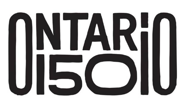
“It’s not clear, it’s not clean - it’s not balanced,” said Richard Powers of the University of Toronto.
“The whole idea of something like this is to showcase a message, and this doesn’t showcase anything in my mind,” said Powers, the national academic director at the Rotman School of Management. “It’s not exactly clear what they are talking about.”
He said the long, lowercase “i” in Ontario “throws everything off. Again, the idea is to convey a message and it’s unclear what the message is here.”
But the government told the Star in a statement that the Etsy-like nature of the design “makes it unique, personal and approachable - something that we know the millennial target values.
“The word mark is set in a friendly, bold, custom typeface and symbolizes our province and the people within it. The letter forms are imperfect but warm and represent the character of our home.”
The logo design, licensing and trademark came with a $30,000 price tag, “in line with what other jurisdictions and campaigns cost.”
In total, the government is spending $100 million on the province’s 150th celebrations and infrastructure projects.